
Dental WebSmart
An organizational and task management tool to support dental practice administrators in setting up EFT Payments with dental insurance.

My Role
Lead UI Design
UX Design
Client Meeting Facilitator
Team
Aidan Sabatino Alex Schrankel Richie Arkanoff
Evan Burr Jackson Murray Ryoma Okano
Janna Johns Qimei Fu Robert Porter
When
Jan 2022 - May 2022
What
Web Application
My Contributions & Learnings
As the lead UI designer for a B2B client project, I eagerly sought out online resources to keep learning and applying the best practice in UI design. Throughout the project, I focused on optimizing the user experience by reducing confusion, increasing learnability and familiarity, and enhancing the focal point. I employed various design principles, such as repetition, contrast, alignment, and proximity, to convey the product's message clearly. Additionally, I effectively mentored first-year students in Figma and design methods and articulated our design rationale to the client, who had limited familiarity with UX design. This experience has deepened my understanding of the importance of effective communication in design projects and has further developed my confidence as a designer.
Client Background
Dental WebSmart provided services to set up Electronic Transfer Fund (EFT) payments for dental practices with insurance companies, which improves dental practices' cash flow by reducing payment turnaround to 2-7 days rather than the previous 30-90 days by mail.
Project Goal
Dental WebSmart wanted to turn its service into a digital product that helps dental practices set up EFT payments by themselves. Our mission is to redesign the current web application for Dental WebSmart's employees to an organizational tool for dental practices to set up EFT payments.
Final Design

A centralized platform for organizing information, contacting insurers, and tracking applications
Access all dental insurance websites and contact information in one place, and track the progress of your applications at a glance for optimal efficiency.

Efficiently and methodically navigate a complex and lengthy application process
EFT application can take weeks to months with much communication with the dental insurance. The operational dashboard lets users track EFT application progress in real-time and efficiently schedule tasks, saving time and hassle.
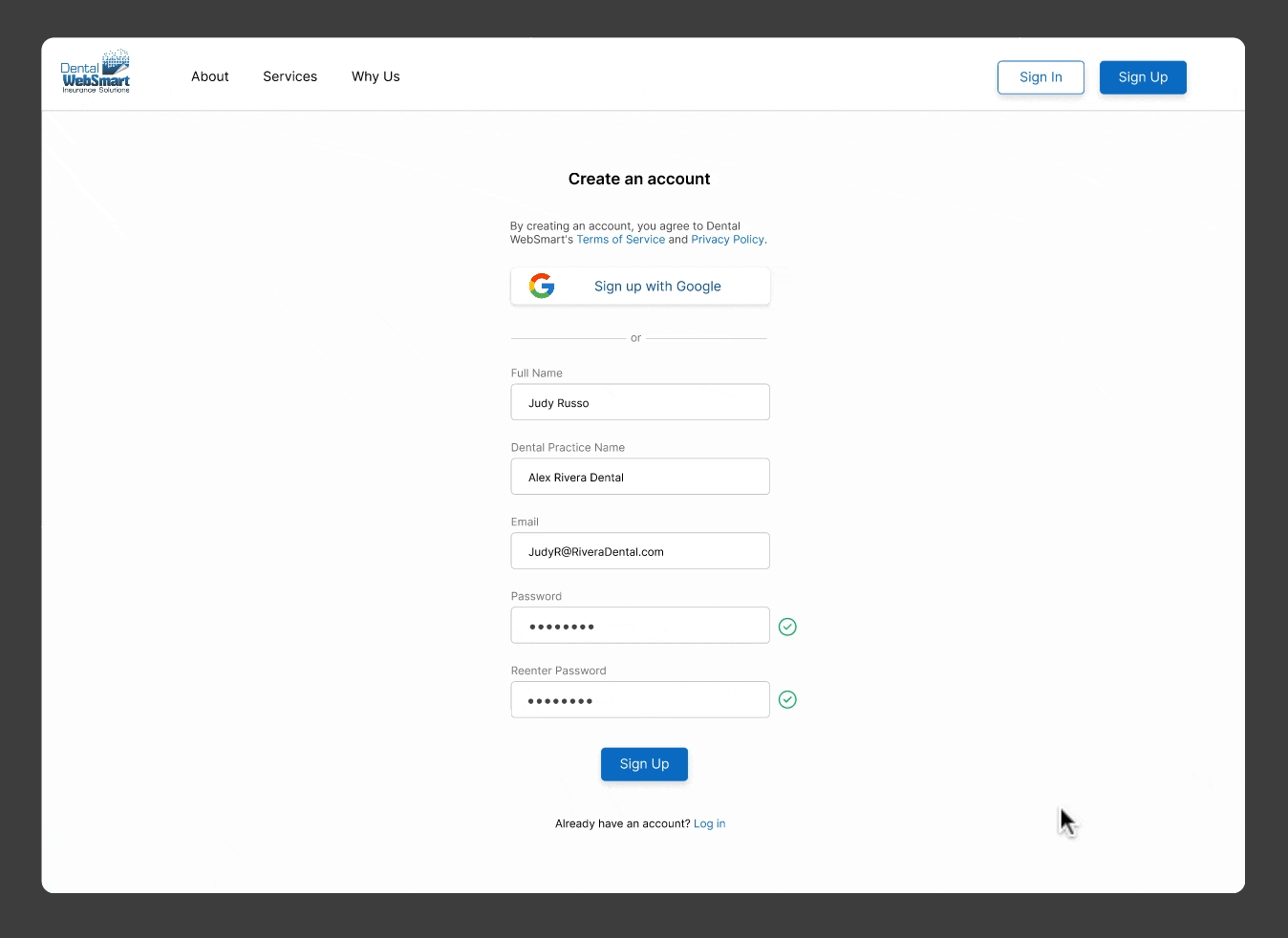
Onboard users right from the start
To apply for EFT payments, dental practices need to provide several confidential documents and information. The onboarding process starts from the confirmation email to the profile filling page to get users fully prepared. Explaining why each information is required can alleviate any confusion and build trust with the users.


EFT Benefit
Expedite patient billing
Improve payment cycle within 2-7 days
Reduce posting errors
Reduce processing costs
Eliminate the threat of lost and stolen checks
EFT Usage
Although EFT payment has the benefits above, only 13% of dental practices have set it up, and the rest are still using mail payment, which takes 30-90 days to complete transaction.
So we decided to do further user interview and expert interview to determine why dental practices are holding back from EFT.
Secondary Research How does EFT benefit dental practices? What is the current level of EFT utilization among dental practitioners?
Primary Research What factors influence EFT adoption and popularity?
We interviewed 4 potential users, the administrators at dental practices, to understand their knowledge of EFT and what problems they encounter with EFT. It turned out that they understood the advantage of EFT, but they haven't incorporated it mainly because of 2 pain points.

Difficulty in tracking applications
One dental practice needs to apply for EFT at many insurance carriers, and the application process can last for months with back-and-forth communications. It's easy to get lost without a centralized tracking system.

Unfamiliarity with the EFT setup process
Dental practice administrators face a major hurdle in the application process due to their unfamiliarity with the EFT requirements, information and the varying design of each insurance company's application website.
Persona Empathize with users
I created a persona of a dental administrator based on our interview insights. The persona helped my team stay aligned with user’s perspectives and helped our client understand the use case more easily.

Site Mapping & Content Audit Understand the current Dental WebSmart Portal
After creating a site map and laying out screenshots of the current portal, we annotated each screen to identify how to navigate the platform, what each piece of content contributes to the EFT setup process, how the clickable elements interact, and which contents are only useful for the current users, Dental WebSmart's consultant, but not our new user group, the dental admins. It helped us pinpoint what could be eliminated and changed in the design phase.

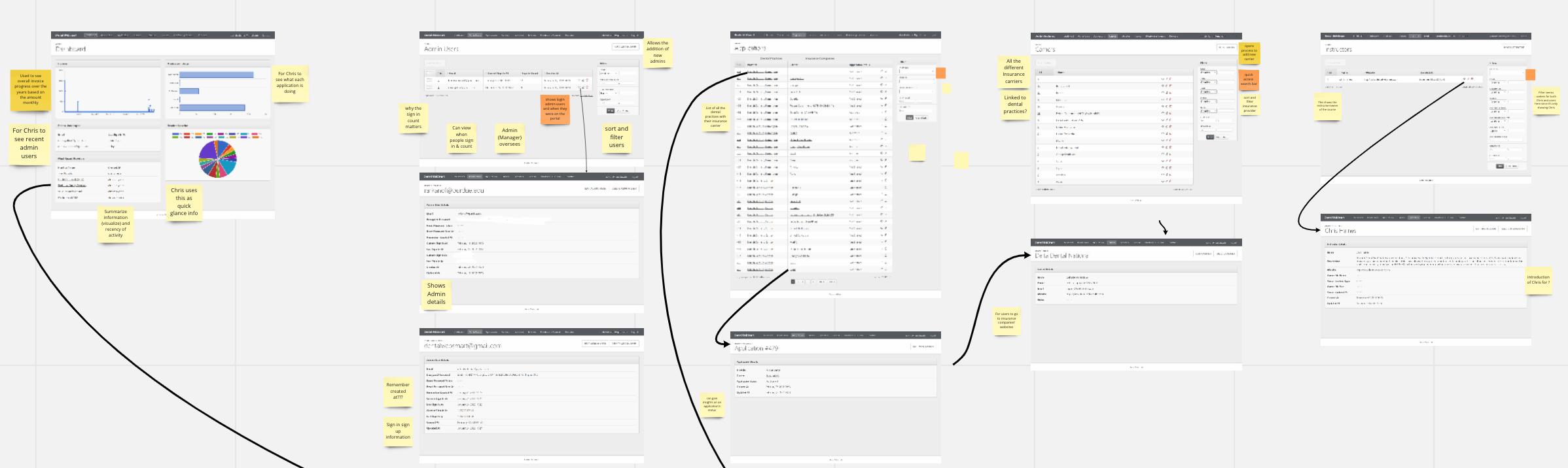

Based on the findings, we can eliminate unnecessary content and further brainstorm a better user flow to guide users through the useful information for EFT.
Ideation
All team members brainstormed ideas and narrowed down by discussing with our client according to the feasibility and usefulness.
Pain Point 1 Unfamiliarity with the EFT setup process
Pain Point 2 Difficulty in tracking application progress
Solutions
Onboarding program for users to follow the steps and understand the process of setting up EFT payments.
Copy/paste needed information to the application websites.
Categorize the EFT-related resources on the current portal into a support tab for users to look for common questions.
Add customer service feature to contact Dental WebSmart for help.
Solutions
Add a note section on dashboard for each carrier to note any updates from the insurance carrier, such as reasons for on-holding.
Show the application status on the Carrier page to scan the status of all applications at once.
Flow Chart
I created a flow chart to see how we can implement the primary functionality into a smooth user flow that's easy for users to understand and navigate.

Prototype & Heuristic Evaluation
After our team created the initial low-fidelity prototype, we conducted a heuristic evaluation based on Jakob Nielsen’s 10 usability principles with 4 other UX designers. The goal was to quickly identify the usability problems and their severity to improve the design further.
To contextualize the participants with our project, I explained the persona and defined the evaluation tasks and goals before we started. Then we analyzed the evaluation results and I refined the prototype accordingly.


Usability Testing & Final Prototype
To uncover the hidden usability issues and users' feelings about our 2nd version design, we conducted usability testing with the "Think Aloud" method with 2 potential users. After the testing, our team analyzed the result together and I designed the final high-fidelity prototype according to the insights and accessibility considerations.


Style Guide
Typography
As I'm designing a web app with a dashboard and need to present a lot of information, I chose a lower contrast scale, the minor third scale, for the typography to be flexible and versatile enough to include longer words and smaller types.
Grid
To ensure consistency for the layout and efficient development for the client, I utilized a 4-point grid system with all the font, line height, padding, margin, and UI components matching the grid.

